10/12/2023
CMYK vs. RGB: Adapting to the Unique Challenges of Print and Digital Design
With graphic design ruling the digital space, it shouldn’t come as a surprise that the market’s revenue is estimated to be up to $11.3 billion by 2024. That’s not to say print media is out of the picture.
Yes, there has been a decline in print media for the past few years, but magazines and print advertisements have done surprisingly well recently. Some of the leading print advertising categories include medicines, ready-to-wear apparel, and direct-response products.
That means both print and digital design are still relevant. But as a designer or a client, you need to understand the unique challenges associated with both types of designs.
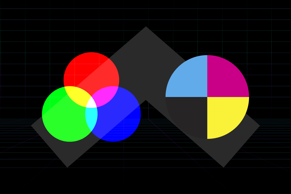
The most pressing one we’ve noticed is the CMYK (Cyan, Magenta, Yellow, and Key) versus RGB (Red, Green, Blue) color space. While the former is most suitable for print media, the latter is better for digital platforms or web design.
How do they both differ? Which considerations should you have in mind when designing for print and digital space? Let’s look at it closely.
Challenges in Print Design
Print design is still large and popular, especially in the corporate world. As you can imagine, the requirements are quite different from typical web design.
Many challenges stem from the physical limitations of paper and ink, ranging from the quality of printing to the size and shape of the page. Here are some of them.
Color Limitations
The first challenge we face as designers is color limitations. Unlike web designs, which can use millions of colors in the RGB color space, print designs are limited to the CMYK color spectrum.
To make it even simpler, the way you see something on a screen is not how it will look when printed out. The colors may be muted, which can make a finished product look different than expected.
The colors are also not as shiny as they are in RGB. So, when a client asks for additional print requests like golden letters and gradients, they increase the cost.
We have to spend some time educating the clients about this difference. Sometimes, they may see an outstanding digital design that they want to print. However, we need to warn them about the cost and color discrepancies that arise from this request.
Due to this, some designs often have to be revamped or changed to look good in print. Simply put, that’s more work for us to do.
Our approach to dealing with this issue is to create mock-ups of the design before printing. It allows our clients to see what the final product will look like and adjust their expectations accordingly.
Color Consistency
In digital design, maintaining color consistency is much easier. If colors appear different on a screen, it’s due to the screen’s settings or the user’s device.
However, that’s not the same with print designs. Maintaining consistent colors across different print materials, like paper, flex, vinyl, etc., can be challenging.
The difference is due to the variations in material time, ink quality, and printing technology. So, branding projects in print require extra attention to ensure consistency across all materials.
At Brangho, we sit with our clients to choose a color palette that can be replicated on different print materials and mediums with little to no color discrepancies.
More Technical
We aren’t talking about SaaS products or app design here. Instead, we mean web design, like landing pages and social media ads.
Print designs are more technical than digital ones due to the color space. Print media has a smaller range of colors than its digital counterpart, and designers must keep that in mind when choosing colors and creating the design.
Then, there are cost constraints. The final product can be expensive if a client wants a special ink like Pantone. So, getting the budget right is crucial.
On top of that, we have to deal with prepress preparations. The files need to be prepared for printing. For example, you must prepare bleed areas, crop marks, registration marks, etc.
Most importantly, we have to work with the printer’s specifications. For instance, if we’re creating a booth design, we consider the printer’s material, size, and other requirements.
Due to the additional technicalities, we spend ample time in the planning phase to ensure the design matches the client’s requirements. It also helps us create an accurate quote and timeline for the project.
Collateral Considerations
Knowing how the client plans to use the collateral is a consideration in both print and digital design projects. But it’s more important for print.
For example, do they want to hang it on the wall as a poster? In that case, we need to ensure the text is readable from a distance.
Or do they want to print the design on business cards? Then, we have to make everything fit without overcrowding the design.
If the design is printed on hand-out flyers and has QR codes, we double (or triple) check that the links are working and the codes can be scanned.
It’s a lot to keep track of, isn’t it? We use a questionnaire to get all these details from the client in our initial discussion. Plus, we ask questions about the timeline, budget, print format, and distribution channels. Then, we use this information to create a roadmap for the project.
Additional Steps
Print design often requires extra steps, depending on the project. Here are some common steps we often have to take.
- Color Proofing: At Brangho, we use color-proofing techniques and materials, like the Pantone Color Bridge Guide, to check how the colors look on paper compared to the screen. Designers have to take this extra step to ensure color accuracy.
- Mockups and Prototypes: Sometimes, when working on projects like packaging material, we have to lay the design flat and envision how it is coming together. In some cases, we need to create a mockup of the product in 3D to show the client what the final product will look like.
- Production Techniques: It’s not as simple as pressing the ‘Print’ button on the computer. We have to consider different print production techniques based on the project’s demand. For example, embossing might work for specific projects but not for others. The same is true for die-cutting, spot varnishing, foil stamping, etc.
Another vital step is proofreading. Before a design goes out for printing, we proofread it for errors. In digital design, rectifying an error isn’t challenging or costly. You can simply go back to Illustrator and fix the mistake.
But in print design, you’ll end up with hundreds of business cards with the eyesore of a typo in the client’s brand name or tagline. It’s a print design nightmare, to say the least. So, we try to avoid it at all costs.
Challenges in Digital Design
You’d think that doing design for the digital space would be easier, but we have some bad news. Although the challenges are not the same, they still exist.
Color Consistency
The way a social media image looks on your iPhone isn’t how it looks on the computer screen or your friend’s Android. Why? Because each device has its own color calibration.
We strive to find the sweet spot between colors that look good on different devices. Clients also offer their input here. For example, if a client tells us most of their audience comes from mobile devices, we focus mainly on mobile phone screen display.
File Sizes
About 40% of visitors leave a website if it takes over three seconds to load. Just three seconds!
That means you cannot have a plethora of high-resolution graphics slowing down your website. You have to optimize images for the web without losing quality.
For a designer, this could mean reduced creativity as they have to keep file sizes low. We counter this by using vector graphics, which can be scaled up without losing quality. Plus, we work with the client to figure out which visuals are absolutely necessary and which ones can be eliminated.
Resolution Adaptation
Again, when designing for the digital space, it’s important to remember that viewers are seeing the design from different screens. The design should be adaptable to different screen resolutions and sizes, such as desktop monitors, smartphones, and tablets.
The difference in screen size also affects image scaling and layout. We’ve all come across those websites where the layout just seems wonky. But then you open the same website on your desktop, and it looks perfectly fine.
At brangho, we avoid this by focusing on responsiveness and building our sites on mobile-first principles. Sometimes, this takes some extra time since we have to adjust the layouts and images for different resolutions. But it’s worth it in the end.
Most of this is done through code. But you still need designers to create assets that work in different scenarios.
Accessibility Testing
Accessibility is a huge consideration in web design. The aim is to make the website easy to use for people with disabilities. It could mean anything from ensuring proper contrast levels for easy readability to optimizing generic elements like buttons and form inputs.
At Brangho, when we work on such designs, we do our best to meet the WCAG (Web Content Accessibility Guidelines) standards. Some examples of accessibility features we consider include:
- Alt Text: The purpose of alt text is to provide a brief description of an image so someone with visual impairments can still understand the content.
- Color Contrast: We check for minimum contrast levels between foreground and background elements to ensure readability for those who are color blind.
- Keyboard Navigation: Accessible websites should be navigable without a mouse or trackpad. Colorado State University has an excellent guide on it that we like.
A/B Testing
When printing for print media, there’s little room for A/B testing due to the high cost associated with repeated printings.
On the contrary, A/B testing on the web can be cost-effective and straightforward. You can use it to check how effective a particular design element is. Then, compare it to its variations and see which one performs better.
We do A/B testing in most, if not all, of our web design projects. It helps us gauge how the visitors interact with the design elements on a website.
Another challenge in this regard is analytics integration. Our designers often have to work with developers to get the right metrics from A/B testing. We use services like Google Analytics to track conversions, clicks, and other data points. The analytics then help us make data-driven decisions.
Maybe the CTA button is clicked more often when it’s red. Or its position needs to be changed to make it more noticeable. You get the point.
Print vs. Digital Design: Choosing the Right Software
Selecting the right software is a challenge in both print and digital design. Our aim is to use software with the right features and tools to produce the desired design outcomes. We also look at collaboration capabilities, ease of use, scalability, and integrations.
At Brangho, we usually opt for InDesign for editorial print pieces like a magazine. It’s quite helpful in creating multi-page documents and has a number of features to make a designer’s job easier.
For example, we can predefine the character styles and paragraph styles to ensure consistency throughout the document. We also use it to create interactive PDFs, which allow for multimedia content.
As for booth and package design, we go for Illustrator. Since it’s a vector software, it’s capable of producing crisp, scalable graphics. It also has features to help design intricate logos and illustrations. We can scale the design without losing quality.
For instance, when doing booth designs, we can make them 1/10th of the original size to reduce the file size. Then, when it comes to printing, the printer can scale the design back to its original size and still produce a high-quality image.
As for file formats, we use PDF for clients’ files since it’s compatible with both Mac and PC. For our team, we prefer AI file format, especially when everyone is working on Illustrator.
For print designs, we opt for JPEGs when sharing images with clients. At times, we’d send PNGs, especially when graphics have to be superimposed over an image.
Takeaway
Whether you’re working on a print or digital project, following the proper criteria for each media is essential. Each media type will have its unique specifications, challenges, and techniques.
At Brangho, we do both quite well. We’ve figured out the workarounds for all the aforementioned challenges. The result? Our print and digital designs align with your marketing and communications objectives. Contact us today to schedule a consultation.
