09/15/2023
Elevating Data Visualization for Impactful Insights: Our Collaboration with Fastly
Picture this: you have done extensive research and have an enormous amount of data and statistics on your hands. Now comes the challenge of presenting this information in a convenient and engaging manner.
Traditional methods of presenting raw numbers may risk losing the reader’s interest, making it essential to find an alternative approach that effectively conveys the data without overwhelming the audience. A logical step would be to visualize the data using simple charts, graphs, and tables, which can make the information more accessible and digestible. This process doesn’t seem like rocket science, as there is certainly an abundance of tools that can assist you in showcasing the numbers.
Although conventional data processing tools like Microsoft Excel can create basic charts and tables, are there more opportunities to visualize data in a more captivating way?
This is exactly what our client Fastly sought out when they contacted brangho. In advance of the release of their Network Effect Threat Report, Fastly wanted to create visuals for the data that would not only inform but also encourage the public to spread the info.
As standard-looking bar charts were not sufficient for Fastly, we took on the task of elevating them into more interesting and appealing infographic-style graphs.
Key use cases for data visualization
The goal of data visualization is to make raw data understandable to its reader. The use of visuals such as charts, tables, and infographics can help simplify dry statistical facts. Throughout many industries, data visualization serves as a powerful tool to convey information.
Harvard Business Review identifies four key purposes of data visualization:
- Idea Generation
Brainstorming the ideas for visualization allows the appearance of diverse perspectives and common concerns. These early-stage visualizations lay the foundation for problem-solving.
- Idea Illustration
Visualizations help convey concepts, processes, and structures. They’re widely used in tutorials, certifications, and even organizational representations, fostering effective communication.
- Visual Discovery
This is the realm of data professionals, where visualizations aid in pattern and trend identification within datasets.
- Everyday Data Viz
The visualization process assists in conveying insights, presenting newfound information in an engaging and accessible manner.
Using our examples, let’s see how these principles are applied to the specific needs for data visualization.
Understanding data visualization through the lens of our work
Introducing our client: Fastly – a major American cloud computing services provider.
Fastly offers an innovative cutting-edge cloud platform to assist developers in expanding their core cloud infrastructure closer to end-users.
With Fastly’s powerful infrastructure at your disposal, you can scale your operations intelligently, bolster security measures, and optimize user experiences. Offloading content to Fastly not only helps you save on expensive bandwidth and storage costs but also lightens the load on your servers or central cloud infrastructure.
Client’s goal:
With the newly released report on global traffic across various industries within Network Learning Exchange, Fastly had a clear objective in mind – to complement their hard data with compelling visuals that would bring clarity to complex statistics. It was equally important to keep these visuals consistent with Fastly’s brand guidelines and design them in a more interesting, creative manner. Fastly turned to brangho’s expertise to craft aesthetically pleasing and functional graphs that would effectively communicate the research findings.
brangho’s approach to data visualization
Let’s analyze the excerpt from the report and see how we can convert the complex data to a simple graph.
As Fastly’s Network Effect Threat Report states:
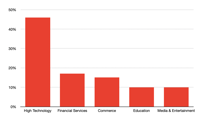
“Between April 1 – June 30, 2023, most IP addresses in NLX data were not concentrated on one customer or industry. Instead, 69% of IP addresses targeted multiple customers, and 64% targeted multiple industries. Moreover, the malicious traffic originating from NLX showed that 46% targeted the High Tech industry, 17% targeted Financial Services, 15% targeted Commerce, 10% targeted Media & Entertainment, and another 10% targeted Education.”
In the realm of data presentation, while this information may be relatively easy to comprehend in theory, visualizing the numbers can make it even clearer and more digestible.
In doing so often arises the question: What approach should we take? Should we create a table? Well, let’s give it a try.
| Vertical | Requests | Percentage of Total Requests |
| High Technology | 16293738446 | 41,78% |
| Media & Entertainment | 10275082980 | 26,35% |
| Commerce | 7347422584 | 18,84% |
| Financial Services | 3454147256 | 8,86% |
| Education | 986088584 | 2,53% |
| Healthcare | 435040056 | 1,12% |
| Other Verticals | 148967810 | 0,38% |
| Public Sector | 54123460 | 0,14% |
| Total | 38994611176 | 100,00% |
Taking in information in this manner is the most common method for people who work with large amounts of data. However, let’s say the typical reader is not too concerned with exact numbers, they want to digest the new information as easily as possible. Instead of using a table, let’s opt for a more intuitive solution – a bar chart:
Phew, that’s better! But now, let’s do it the brangho way:
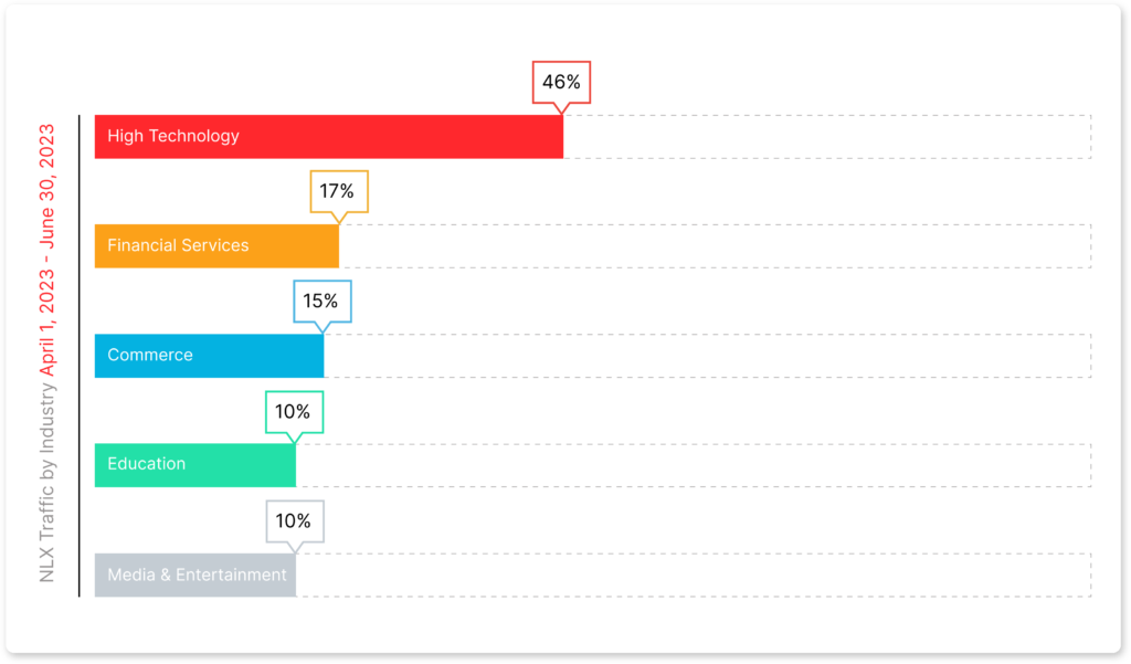
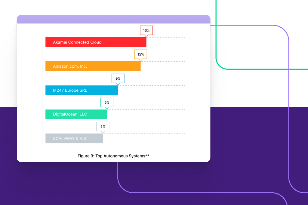
In the graph above, we have implemented Fastly’s native color theme and styled it to present a more sophisticated solution for visualization, moving away from a basic look often associated with Microsoft Excel. Adding easy-to-follow percentage numbers and updated bars enhances the understanding of the data.
As we can see in this example, uncovering insights through data visualizations outpaces the process of scanning a table. The information presented in both the chart and the table is identical, yet our brain processes and comprehends the information much more clearly when we rely on data visualization.
Through the “brangho way,” Fastly’s data is not only made more accessible but also aligned with their branding, ensuring a concise visual presentation.
Turning sketches into life
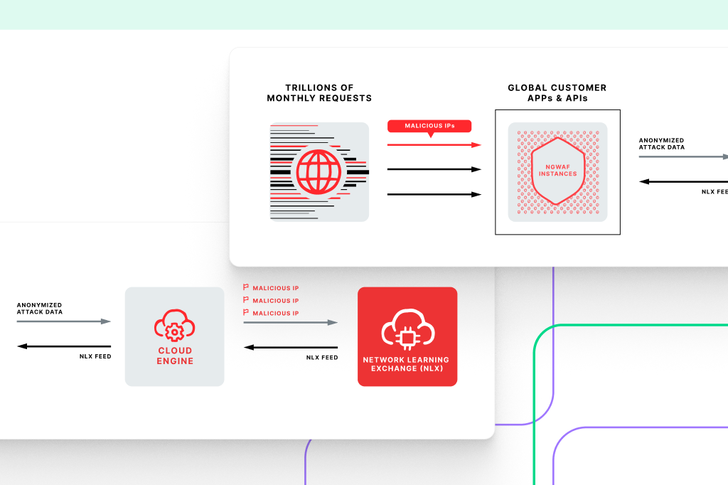
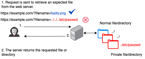
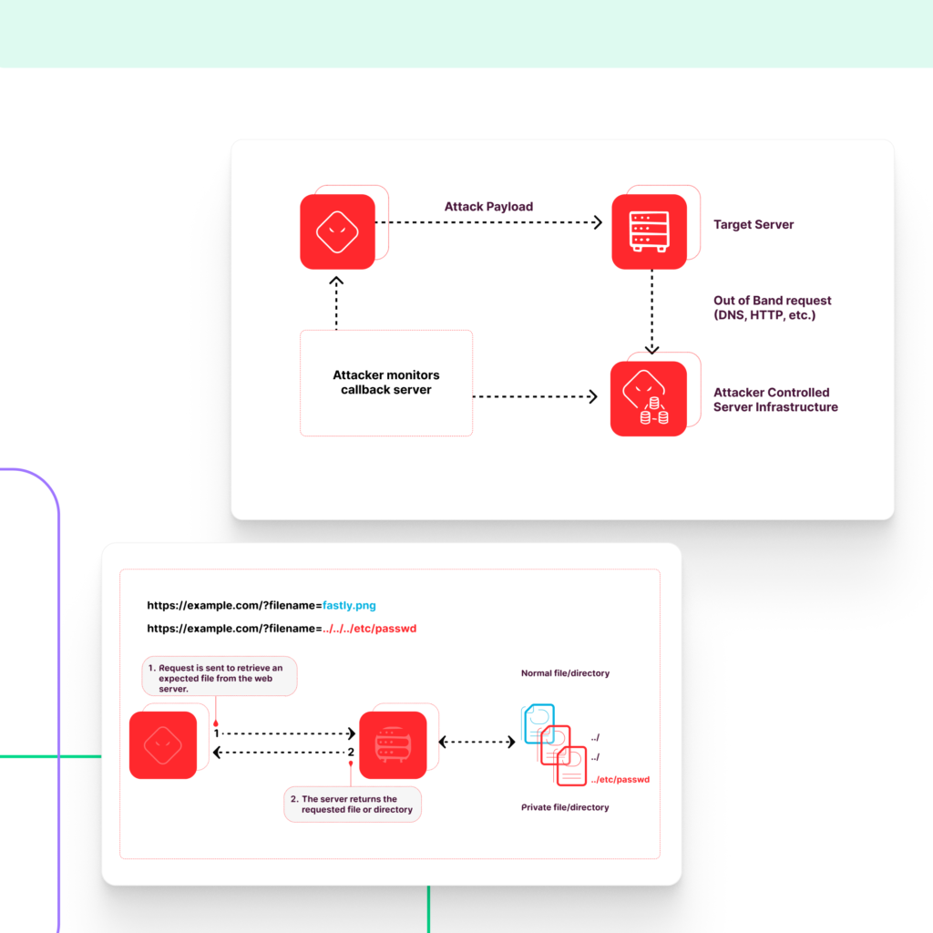
As part of our collaboration with Fastly, we also transformed schematic mockups into engaging infographics-like diagrams. In this process, we incorporated brand-specific icons, fonts, and design elements into the mockups.
In the diagrams, Fastly illustrates how attackers exploit traversal vulnerabilities of the servers to gain unauthorized access to the user’s files and manipulate them. In this way, hackers can uncover sensitive data, manipulate application information, and potentially execute remote code.
As seen in the following images, we have adhered to the client’s guidelines in order to streamline the icons, making them look polished and professional. We’ve also rearranged the text within the images to create a more logical flow of events, resulting in a cleaner, less cluttered design.

Process and Results:
After brainstorming several ideas on how to effectively convey and understand the data we were given, we were able to find the best way to visualize the information.
Our designers have created a variety of graphs and pie charts. The screenshots below provide a glimpse into our design process:
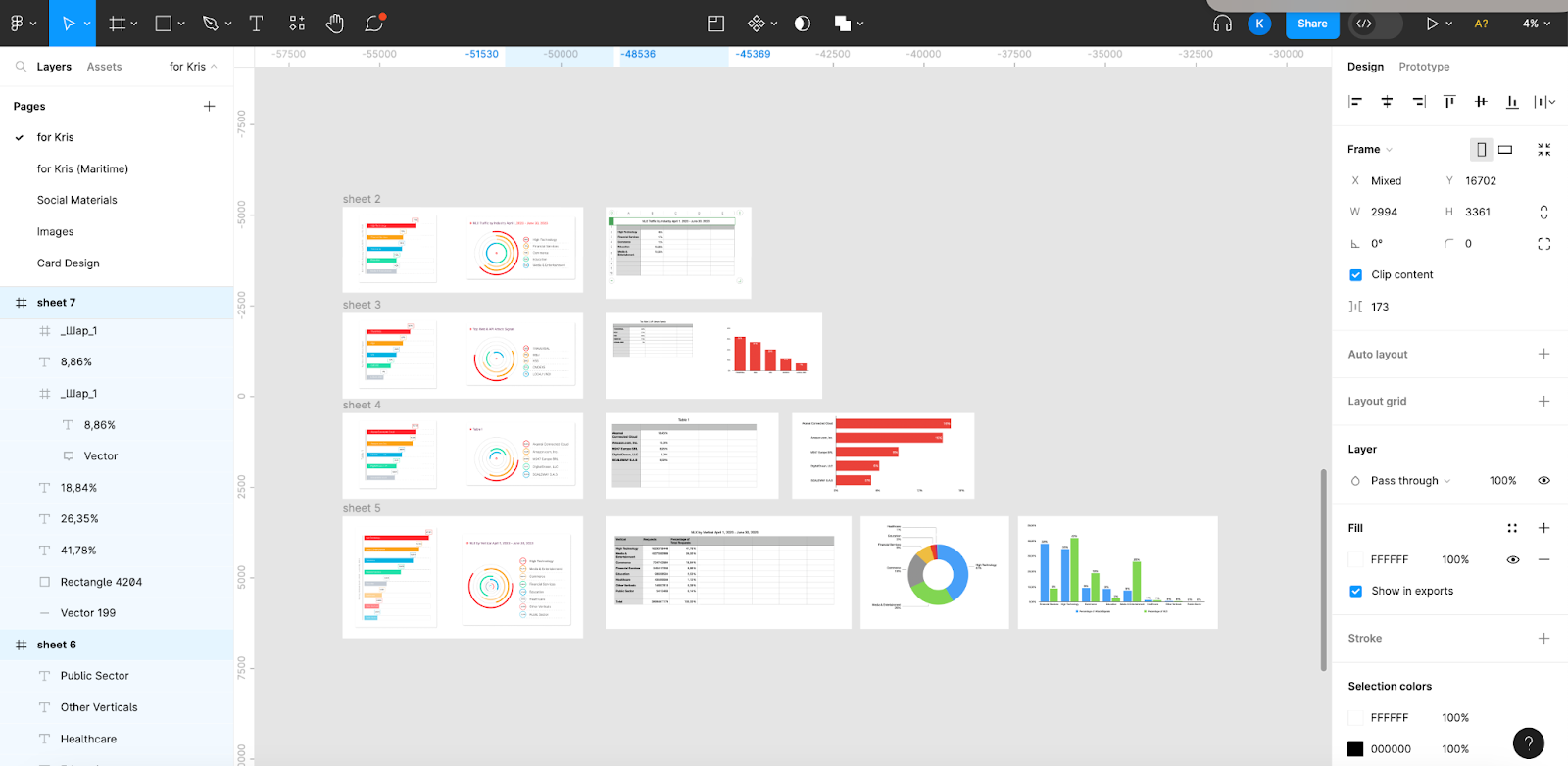
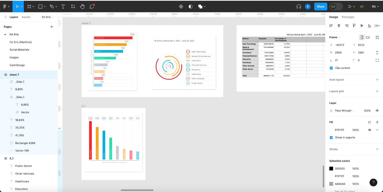
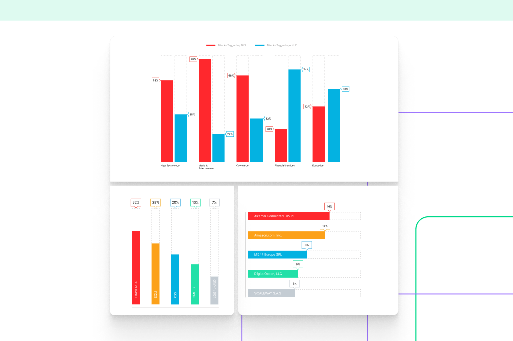
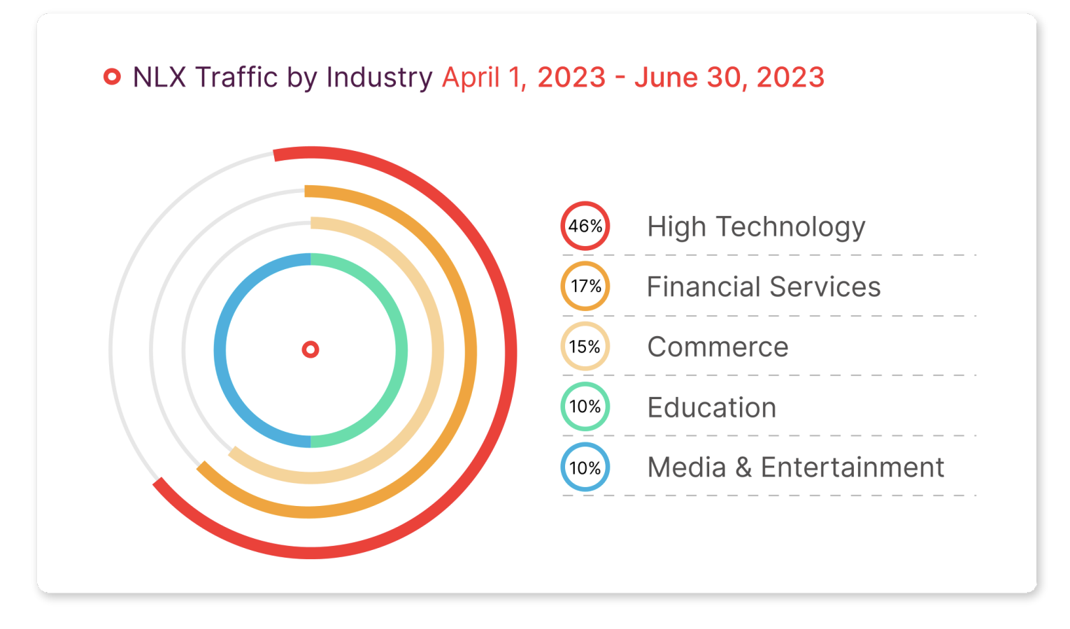
As a result, we’ve successfully elevated Fastly’s standard bar charts into visually captivating visuals, aligning with the client’s vision. Our efforts helped Fastly’s team meet their objective of creating a visually compelling report that would have an appeal to be shared online.
Make sure to read Fastly’s complete report and explore our visuals here.
Need help with your designs? Do not hesitate to reach out – we are always here to assist you.
