08/24/2023
How to Design With Accessibility in Mind: Explaining 508 Compliance
According to WHO, about 1 in 6 individuals experience a type of disability, comprising around 1.3 billion people across the globe. Yet, 1 in 10 public-facing and 3 in 5 internal websites at major US departments and agencies are not completely accessible for those with disabilities. In simple words, this is depriving 16% of the world’s population of using digital features.
For people with disabilities, 508 Compliance obliges federal institutions to ensure accessibility in their website design. Accessibility in design means creating inclusive designs that everyone can access digitally and in print, regardless of their capabilities.
If you’re a designer with no experience in creating a 508-compliant design, this post discusses everything you need to know. So, let’s dive in!
508 Compliance: How Important It Is for Designers
In this era of inclusivity, designers must address the accessibility needs of disabled individuals as described in The Rehabilitation Act (1973). The Act has a section called “508 Compliance” solely dedicated to ensure website accessibility.
The law requires government websites to have an inclusive design to cater to people with disabilities equally. Not only government institutions, but private companies and small businesses can also benefit from 508 Compliance.
If you’re a designer, fulfill the below requirements to create a section 508-compliant web design:
- Technical Requirements. As a designer, ensure that the website’s operating systems, software, and coding support assistive technologies. These could be virtual keyboards, text-to-speech features, screen magnifiers, or anything that makes the information available to everyone.
- Functional Requirements. The designer should ensure everyone can access the website’s features effortlessly, regardless of their capabilities. This includes easy navigation through different categories, using the search bar, subscribing to newsletters, etc.
- Support Requirements. A good design provides different support materials to enhance user experience. The designer must make these resources accessible to everyone, especially individuals with disabilities, to help them communicate their concerns easily.
Remember, these standards aren’t just limited to electronic content but can also encompass print designs.
How to Create an Accessible Design?
508 Compliance is the standard for making an inclusive design. Following it will surely make your design accessible, but only to an extent. You’d also have to put in extra effort to ensure everyone can access it, whether in print or on the web.
To make sure your design is inclusive, here are some aspects you should keep in mind when designing for 508 compliance:
Add Synchronized Captions and Subtitles to Videos
Attractive content includes videos, photos, and GIFs to grab the audience’s eye at first glance. Here is how you can make your print and website design attractive and accessible at the same time:
- If your website has videos, add synchronized captions and subtitles to them. It will allow people with hearing impairments to understand your content easily.
- Regarding print designs, you can include QR codes directing users to a video with subtitles or an audio recording. The screen reader will convert the text into audio for easy comprehension.
You can manually add captions to each video frame or provide them to the video players. If you opt for the second option, ensure to add timestamps to the captions and convert them into a readable file format. The player will overlay the subtitles on the video in real time.
Provide Alternative Text with Images
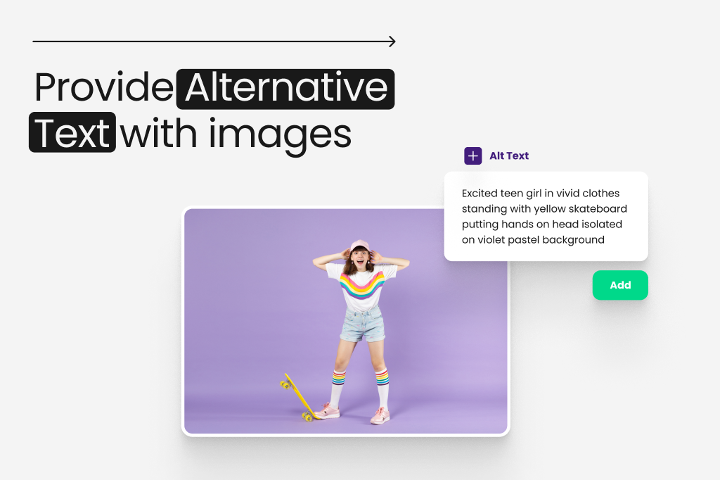
Sometimes, images occupy less space in a design and convey more information than the text. That’s great for user engagement, but how can people with visual impairments understand these photos? That’s when the alternative text (alt text) comes in.
Alt texts describe the purpose and content of the image, which users can understand through screen readers. These programs turn the text into speech to let those with visual impairments hear the information.
As a designer, you should ensure three things when adding alt texts to your images:
- Don’t just add a one-word alt text to your image. For instance, a photo describing a step-by-step buying process shouldn’t have an alt text saying “buy a product.” That won’t tell users what product you’re talking about, let alone how they can purchase it.
- Your alt text must communicate with the disabled individual the same way the image does with a sighted user.
- Avoid including so many decorative details in your alt text, or the user will get tired of listening to “decorative boxes or lines” on the screen reader again and again.
Ensure Accessible Color Contrast
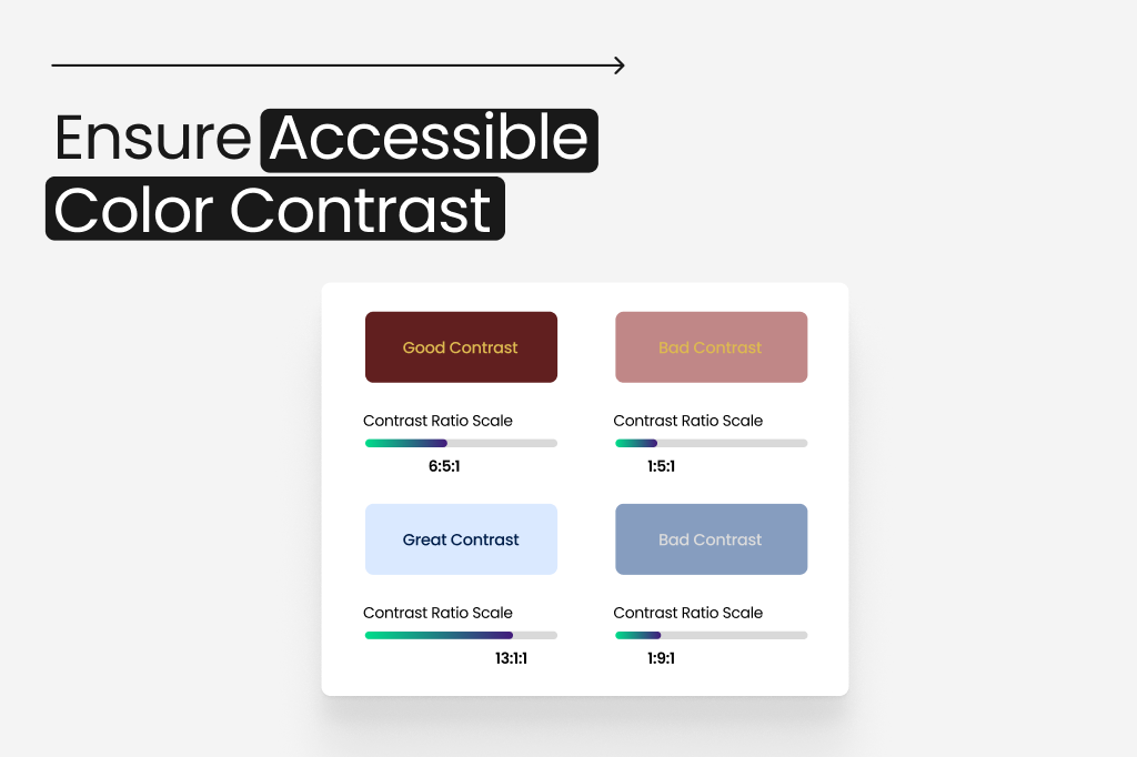
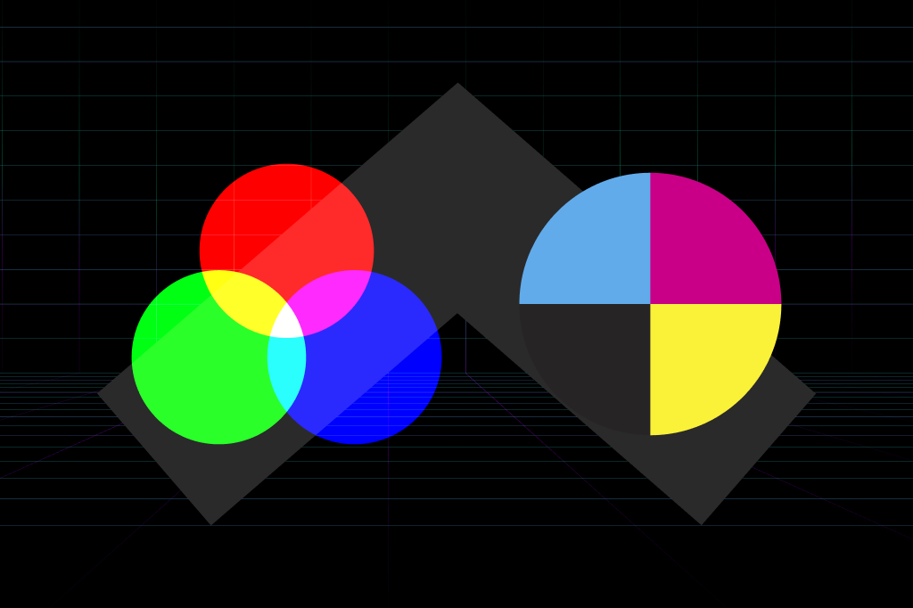
Visual disabilities can be of many types. For some people, it is difficult to comprehend a shape, while others can’t perceive specific colors. When creating a design, make sure to consider all these concerns, including but not limited to:
- Every color has a specific meaning. For example, red draws attention, yellow portrays happiness, and green represents tranquility. You must attach these meanings to your designs to resonate with all users alike.
- Whether you’re working on a print or web design, always use opposite color contrasts for the text and background. For example, if you choose a light-colored background (yellow or white), keep your text dark-colored (black or dark blue).
- Print materials usually look good in black and white. But if you want to use colors, keep them to headlines and titles only.
- Focus on the alignment of the design. Texts with center or right alignment are typically hard to read, especially in print designs. So, always keep your content left-aligned.
Use Easily-Readable Fonts
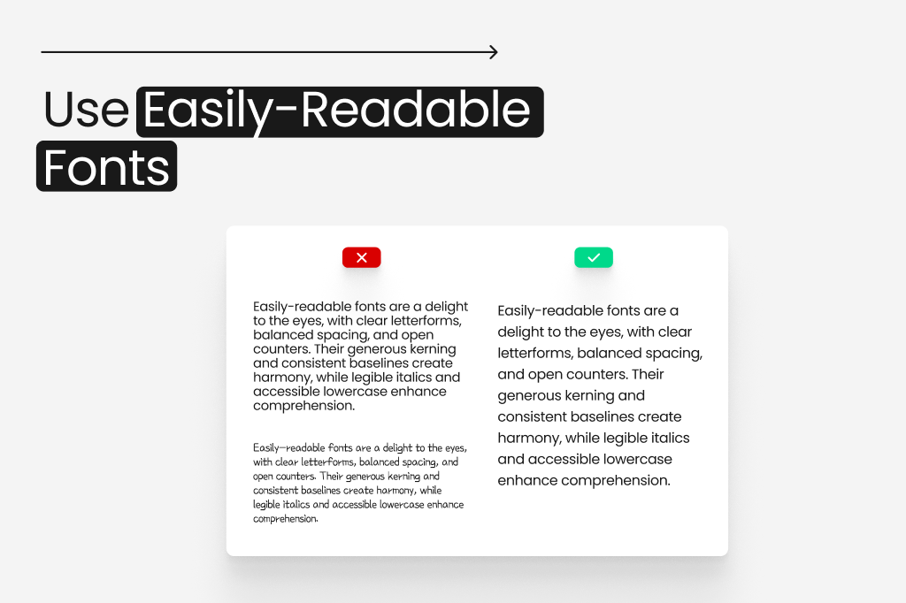
You may have heard: “The bigger, the better.” Well, that applies to designing too! In both web and print designing, you must keep your text’s font large enough to be read and understood by everyone. Here are some tips to help you out:
- The ideal point size should be between 12 and 18, depending on your selected font.
- The space between the lines must be about 25% to 30% of the point size to allow users to move through the content easily.
- Avoid too decorative or complicated fonts, as they can confuse many people with visual impairments. Some good options are Arial, Verdana, Calibri, and Times New Roman.
- To increase readability, try distributing large chunks of text into tables and using wide binding margins. It will help those with visual impairments go through the text without difficulties.
Extend the Timeouts for Form Submissions
Online form pages have timeouts that require users to read the requirements and enter the details within a designated time. While people without impairments can do this easily, those with disabilities will need additional time.
As a designer, you should include the below features in your 508-compliant design to show some courtesy to those with disabilities:
- It must allow the users to request more time for form submission before the system resets their progress or logs them out.
- It should notify the users about their remaining session minutes, so they speed up and submit the form on time.
- Your print design must be in a matte finish to minimize glare.
- Avoid using watermarks on the print design as they create confusion.
4 Tools for Checking Your Design’s Accessibility
As you can see, designing for 508 compliance requires effort, time, and resources. But how can you ensure your print and web designs are completely accessible to everyone? Luckily, there are many top-notch accessibility checkers which allow designers to check their progress and make improvements where needed.
Print Design Accessibility Checkers
If you want to use a tool to double check your accessibility design, here are two good options to begin with.
- Adobe Acrobat Pro
Adobe Acrobat Pro helps users create accessible PDFs based on the WCAG 2.0 guidelines. You can also check the accessibility of your existing print designs on this tool. It will instantly evaluate your content, suggest fixes, and summarize the results in a comprehensive report.
Adobe Acrobat Pro only charges $19.99/mo for all these features. Not a bad deal, right?
- Microsoft Accessibility Checker
If you’re crafting your print content on Microsoft Word or PowerPoint, you can check its accessibility within the program. Look for the “Review” tab on the top and select “Check Accessibility” to access the “Accessibility” option.
The Accessibility dashboard will give you a detailed accessibility report under “Inspection Results,” including errors, warnings, and how-to-fix suggestions. If you have the product key for Microsoft Office, you can use the Accessibility Checker feature for free. Otherwise, be prepared to pay $99.99/year.
Web Design Accessibility Checkers
Here are two efficient tools for checking your web design’s accessibility:
- DYNO Mapper
DYNO Mapper is, hands down, the best website accessibility evaluation tool for various reasons. First, it allows users to check and view the accessibility of any app and website within the browser.
Second, the platform creates sitemaps and arranges subdomains and links. DYNO Mapper also gives you a detailed report about your website’s accessibility. Because of all these features, the price for this tool starts from $49 a month.
- WAVE
WAVE is another web accessibility testing tool that tells users how accessible their content is based on the WCAG guidelines. You can also use the platform to evaluate your existing website content and identify areas of improvement.
The platform also generates comprehensive reports to help you see your website’s progress. The pricing for WAVE plans starts from $10 for 250 credits ($.04/credit).
Examples of 508-Compliant Designs
You now know what accessibility in design is and how you can ensure it in your content as a designer. But if you’re still unsure, here are some great examples of 508-compliant designs to clear your mind:
Example 1: TOMY (Web Design)
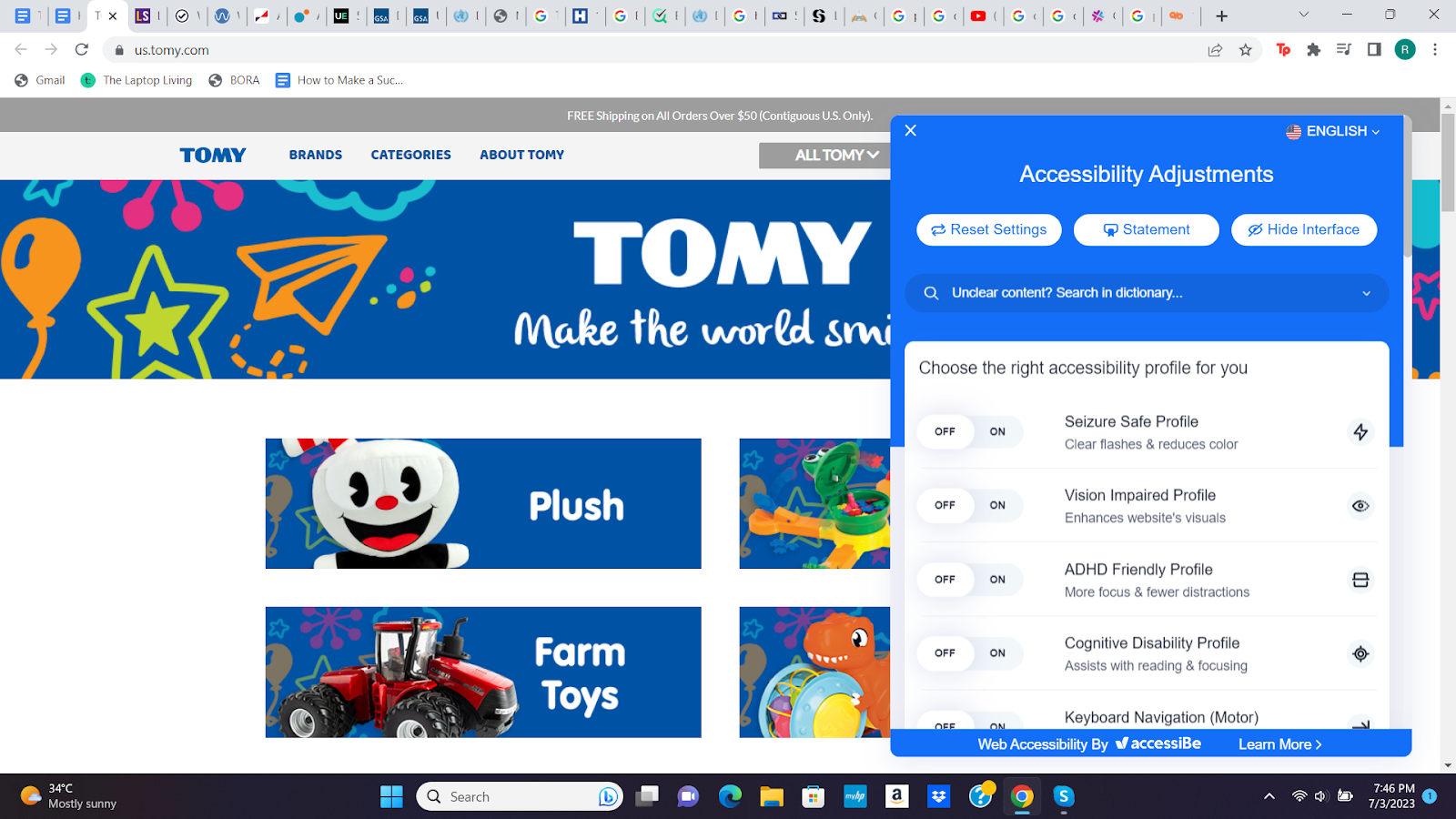
TOMY aims to make everyone smile without discrimination, and its website speaks for its motto. It has an accessibility adjustment panel, which allows users to adjust the color, content, and sounds per their needs.
Example 2: Brangho (Print Design)
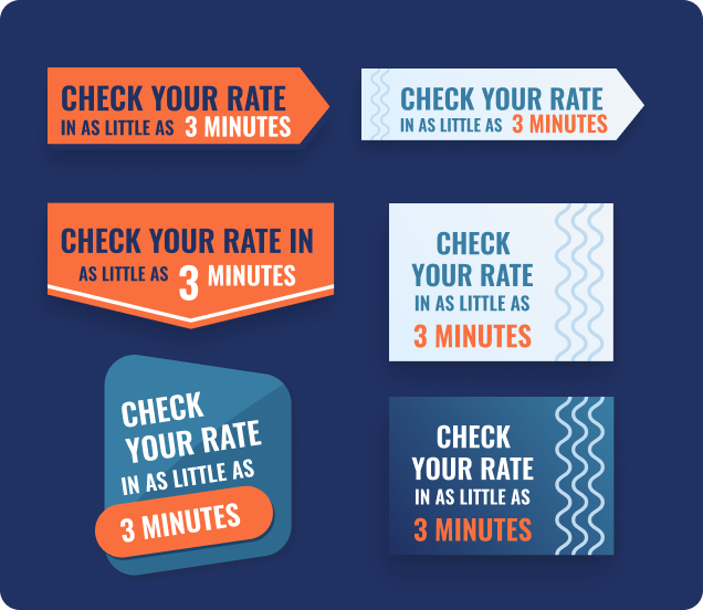
At Bragho, you will find designs in ideal color contrast, font type, and size for easy accessibility. Our designers use prominent and clear fonts and work with light and dark color contrast for the background and the text.
Conclusion
Accessibility allows users with different capabilities to interact better with print and web designs. The 508 Compliance Amendment was exclusively for federal agencies’ websites, but you should comply with it when creating any type of design. You can do so by:
- Adding synchronized captions and subtitles to videos
- Providing alternative text (alt text) with images
- Ensuring accessible color contrast
- Using easily-readable Fonts
- Extending the timeouts for form submissions
Need an expert designer’s help? Connect with us now to gain assistance with all your design concerns!
